|
 |
|
 |
|
| Author |
Message |
joberg
Community Member
.jpg)
Joined: 06 Oct 2008
Posts: 9447
|
 Posted: Wed Jun 22, 2011 7:53 am Post subject: Posted: Wed Jun 22, 2011 7:53 am Post subject: |
 |
|
I might be completely wrong (it has happened before  )) but it seems to me that the beer can logo is the same as the one JT has at the bottom of his page: )) but it seems to me that the beer can logo is the same as the one JT has at the bottom of his page:
Con-Am 27 |
|
| Back to top |
|
|
|
|
 |
|
 |
|
|
|
|
| Author |
Message |
Lanboy
Community Member
Joined: 25 Feb 2008
Posts: 44
Location: Toronto, Ontario Canada
|
| Posted: Wed Jun 22, 2011 12:14 pm Post subject: |
|
|
There must be more to it than just the Con-Am 27 logo though...
Con-Amalgamated Extra Stout?
Just a heads-up...I picked up a pretty nice t-shirt with the Con-Am 27 logo on it from a UK company:
http://www.lastexittonowhere.com/shop/product/con-am-27-regular-fit-t-shirt/
A little bit on the expensive side, but great stuff - Outpost 31 from The Thing, WOPR from War Games, etc. |
|
| Back to top |
|
|
|
|
|
|
|
|
|
|
|
| Author |
Message |
Mike Rush
Community Member

Joined: 30 Jul 2009
Posts: 184
Location: Hertfordshire, England
|
| Posted: Wed Jun 22, 2011 1:16 pm Post subject: |
|
|
If that is the Con-Am logo on the can (not saying it isn't, just that I can't see it for sure) then the chances are it wouldn't have '27' on it. Don't forget the company is Con-Amalgamated, the Io facility is #27. 
_________________
Mike
"We're not heroes - we're from Finchley" |
|
| Back to top |
|
|
|
|
|
|
|
|
|
|
|
| Author |
Message |
joberg
Community Member
Joined: 06 Oct 2008
Posts: 9447
|
| Posted: Wed Jun 22, 2011 1:28 pm Post subject: |
|
|
Possible that the #27 is not on the beer can, what I wanted to say is that it seems that it's the logo Con-Am on the can...there's also other details on it, but with no good pics it's difficult to make out  |
|
| Back to top |
|
|
|
|
|
|
|
|
|
|
|
| Author |
Message |
Lanboy
Community Member
Joined: 25 Feb 2008
Posts: 44
Location: Toronto, Ontario Canada
|
| Posted: Wed Jun 22, 2011 2:31 pm Post subject: |
|
|
| Right, the beer cans are probably a generic company product like the helmets - it looks like they have the Con-Am logon on the side, right at the temple. |
|
| Back to top |
|
|
|
|
|
|
|
|
|
|
|
| Author |
Message |
8th_Passenger
Community Member

Joined: 28 Nov 2009
Posts: 443
Location: Hertfordshire, UK
|
| Posted: Wed Jun 22, 2011 2:57 pm Post subject: |
|
|
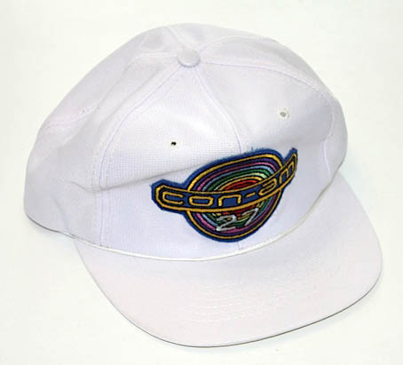
Interesting stuff Mike. I hadn't noticed any of the insignia badges from Outland. But it figures. I like the idea that Outland could be in the same future as Alien.
Thought it was worth posting a picture of my Thinking Cap 'Con-Am 27' cap to add to the thread.
I looked to see if one had been on posted in the Nostromo Jacket thread but I couldn't find one.
I assume they are as rare as the Nostromo cap.
I also have this strange A3 photo book. It must be some kind of press release. They are actually photographs and not printed paper. Some have pictures on both sides, with the photographs being stuck back to back. There is a mix of colour and black and white photographs with a bit of text.

Colin |
|
| Back to top |
|
|
|
|
|
|
|
|
|
|
|
| Author |
Message |
Mike Rush
Community Member
Joined: 30 Jul 2009
Posts: 184
Location: Hertfordshire, England
|
| Posted: Wed Jun 22, 2011 4:53 pm Post subject: |
|
|
They are rare, certainly! I have two of the white cap, although one is in somewhat 'used' condition.
I was reminiscing recently about how I saw, in the window of Forbidden Planet in London, a whole cardboard box full of the Con-Am caps in all the colours, for some silly price like a pound each because they didn't sell well. Oh for a time machine. 
I also have this, which came straight from John Mollo.

Interesting 'book' too. I've seen (and own) some of those photos, but not all! Definitely appears to be some sort of press kit.
Re the logo, I believe on the side of the shuttle it appears without the '27' - which of course is absolutely correct.
_________________
Mike
"We're not heroes - we're from Finchley"
Last edited by Mike Rush on Thu Jun 23, 2011 8:39 am; edited 1 time in total |
|
| Back to top |
|
|
|
|
|
|
|
|
|
|
|
| Author |
Message |
joberg
Community Member
Joined: 06 Oct 2008
Posts: 9447
|
| Posted: Wed Jun 22, 2011 6:42 pm Post subject: |
|
|
Yep, like the beer aboard the Nostromo: Yutani logo is present, why not here also.
Collin: great pics and that press kit is indeed very rare, thanks for sharing  |
|
| Back to top |
|
|
|
|
|
|
|
|
|
|
|
| Author |
Message |
Bwood
Community Member
Joined: 20 Sep 2009
Posts: 843
|
|
| Back to top |
|
|
|
|
|
|
|
|
|
|
|
| Author |
Message |
andy
Community Guide

Joined: 01 Nov 2006
Posts: 6237
Location: Rochester, NY
|
| Posted: Thu Jun 23, 2011 1:44 pm Post subject: |
|
|
I have the Outland Photo Novel, which is like the Alien one with (low res) pictures of the movie and the dialogue. Nothing in it all that great unfortunately, but still very cool. I will look to see if i can finally undig out my copy of the Cinefex too.
Andy |
|
| Back to top |
|
|
|
|
|
|
|
|
|
|
|
| Author |
Message |
Mike Rush
Community Member
Joined: 30 Jul 2009
Posts: 184
Location: Hertfordshire, England
|
| Posted: Fri Jun 24, 2011 3:09 am Post subject: |
|
|
There are some really nice photos of the shuttle in Cinefex.
Thanks for the link Bwood. Not much stuff there. Some patches, but... well, it makes me angry (or is it sad) that over time, people copy and copy each other's patches until the shapes and colours are so far from the original it's disgusting. There's only one Con-Am patch that looks 'right' and that's the one that says it's from 1981. As for those round department patches - aaaargh! Not very accurate, the keys are the wrong way round... it's not sour grapes, I just hate to see these things done so badly.
That said; I would love to know where the 'One year remote' patch comes from. I've certainly never seen it in the film.
Also, it did remind me of at least one department that I'd missed off my list: transportation. Yario wears red and works in the dock, and this patch is on his arm - as seen in one frame of the photonovel!

(The above image is a bit of a guess - I don't even know the correct colours for sure.) Notice that it resembles a wagon wheel; perhaps another deliberate reference to westerns, along with the sheriff stars and the saloon doors?
Some more trivia for you: you probably know that Peter Hyams likes to use 'Consolidated Amalgamated' or variations thereof in his films. Wikipedia says it's in Capricorn One; I think I also heard it in The Star Chamber, but I could be wrong as it was years ago when I saw that.
You almost certainly know that the yellow barrels at Cyberdyne in Terminator 2 are labelled 'Polydichloric Euthimal'. Respect due to James Cameron for a really obscure reference!
I never knew that Spota is named after Peter Hyams's wife, and he uses the name whenever he can.
On the screen when O'Niel is running employee checks you can see Mary Selway (Catering). Mary Selway was a famous casting agent who worked on Outland.
Also on that screen when O'Niel asks for employees with a criminal record, the list contains 'Wooton'. Wooton is mentioned at the start of the film by the miners, as being the 'shop steward'. I like to think that's a subtle gag to show that he's a nuisance!
_________________
Mike
"We're not heroes - we're from Finchley" |
|
| Back to top |
|
|
|
|
|
|
|
|
|
|
|
| Author |
Message |
joberg
Community Member
Joined: 06 Oct 2008
Posts: 9447
|
| Posted: Fri Jun 24, 2011 1:20 pm Post subject: |
|
|
Thanks Mike for those tit-bits of info...always like those little trivia about a director or the film  |
|
| Back to top |
|
|
|
|
|
|
|
|
|
|
|
| Author |
Message |
SKIN JOB 66
Community Member

Joined: 16 Jan 2008
Posts: 2724
Location: FRANCE
|
| Posted: Sun Jun 26, 2011 8:15 am Post subject: |
|
|
Great post Mike, I had never noticed anything you mentioned before !

Colin, I'd really like to see more on some of this very cool (and very rare) pressbook... Especially the photo of O'Neil in front of all these monitors (and the infirmary photo also)...
Fred
_________________
THE FUTURE IS A THING OF THE PAST |
|
| Back to top |
|
|
|
|
|
|
|
|
|
|
|
| Author |
Message |
Bwood
Community Member
Joined: 20 Sep 2009
Posts: 843
|
|
| Back to top |
|
|
|
|
|
|
|
|
|
|
|
| Author |
Message |
joberg
Community Member
Joined: 06 Oct 2008
Posts: 9447
|
| Posted: Mon Jun 27, 2011 7:22 am Post subject: |
|
|
| Let me guess: a Casio maybe |
|
| Back to top |
|
|
|
|
|
|
|
|
|
|
|
| Author |
Message |
SCOFFMAN
Community Member

Joined: 23 Mar 2008
Posts: 126
Location: Spokane, WA
|
| Posted: Mon Jul 11, 2011 10:33 pm Post subject: |
|
|
I was just curious, but has it been pointed out before that the departmental badges from Alien and Outland are reminiscent of Japanese Mon? That's totally what I thought of when I first saw them, and even though they are in 3 or 6 point symmetry and a lot of mon are in 5 point, when you look at mon designs as whole they pretty much run the gamut. And if there is a deliberate reminiscence, is there any significance to it? Just wondering...
scoffman
_________________
Fiery the angles fell, deep thunder rolled around their shores, burning with the fires of Orc. |
|
| Back to top |
|
|
|
|
|
|
|
|
|
|
|
| Author |
Message |
SKIN JOB 66
Community Member
Joined: 16 Jan 2008
Posts: 2724
Location: FRANCE
|
| Posted: Tue Jul 12, 2011 9:59 am Post subject: |
|
|
I really don't know if they were inspired by Japanese money... but Dallas' officer pin definitely looks like a YI KING arcana...
Fred
_________________
THE FUTURE IS A THING OF THE PAST |
|
| Back to top |
|
|
|
|
|
|
|
|
|
|
|
| Author |
Message |
SCOFFMAN
Community Member
Joined: 23 Mar 2008
Posts: 126
Location: Spokane, WA
|
| Posted: Wed Jul 13, 2011 7:55 pm Post subject: |
|
|
No, not Japanese money, Mon - Japanese family heraldic symbols or emblems. http://en.wikipedia.org/wiki/Mon_(emblem) (Hmm, for some reason I can't get the URL tags to work on this link... maybe the parathesis are throwing it off - sorry, you'll just have to copy & paste!)
As I said there's a huge amount of variations among them, but many are within a circle and are symmetrical in design, which is what made me think of the comparison in the first place. Here's a link to some examples: http://lloydkahn-ongoing.blogspot.com/2009/11/crests-on-traditional-japanese-clothing_16.html
_________________
Fiery the angles fell, deep thunder rolled around their shores, burning with the fires of Orc. |
|
| Back to top |
|
|
|
|
|
|
|
|
|
|
|
|
You cannot post new topics in this forum
You cannot reply to topics in this forum
You cannot edit your posts in this forum
You cannot delete your posts in this forum
You cannot vote in polls in this forum
|
|
|
|
|
|
|
|