|
 |
|
 |
|
| Author |
Message |
Tom Southwell
Community Member
Joined: 01 Mar 2013
Posts: 241
Location: Southern California
|
 Posted: Fri Apr 05, 2013 2:05 am Post subject: Posted: Fri Apr 05, 2013 2:05 am Post subject: |
 |
|
Joberg said:
... the logo of my V.K. is 4cm x 3cm wich is to say that I'm off by 1/16th of an inch each way (plus for the lenght and minus for the width) :shock: Now that's freaky
I'm not surprised, joberg, (based on your usual attention to detail.)
TS
Andy,
You are welcome.
I think it was spinner44 I told years ago about the Groucho album.
TS
Kipple,
My copy of Groucho is very damaged. Yours looks like new.
In 1980 Ridley suggested a "computer" typeface for police and every "computer" font I just hated. They all were sooooo ugly and unbalanced.
I'm sure I looked at every Lubalin (ITC) font, Glaser font , and I don't think Emigre was there in 1980, so I saw an ad in the newspaper for this Groucho show on tv, and the lettering reminded me of the underside of the Nostromo in Alien with it's repeating scallops. So I tried that and Ridley liked it...but asked for an outline on the car to get it even MORE complex.
Today, most designers would have to find a computer font on their computer. Most do no hand lettering. They haven't been trained. Almost a lost art. Those big hand lettered signs in the big supermarket windows of the 50's and 60's are being indicated with computer fonts and it's all wrong.
TS
_________________
I've seen things you people wouldn't believe... |
|
| Back to top |
|
|
|
|
 |
|
 |
|
|
|
|
| Author |
Message |
SKIN JOB 66
Community Member

Joined: 16 Jan 2008
Posts: 2724
Location: FRANCE
|
| Posted: Fri Apr 05, 2013 2:27 am Post subject: |
|
|
Thank you again Tom for all the awesome info shared here !
BTW the "Planes of the Head" head was also used in BRAINSTORM iirc...

Fred
_________________
THE FUTURE IS A THING OF THE PAST |
|
| Back to top |
|
|
|
|
|
|
|
|
|
|
|
| Author |
Message |
Mr Webber
Community Member
Joined: 13 Apr 2008
Posts: 1824
Location: Terra Australis
|
| Posted: Fri Apr 05, 2013 4:24 am Post subject: |
|
|
I know weve all seen Dangerous Days and read Future Noir but to gain such gems from an insider, through this kind of medium, in such an awesome manner is really another level again.
| Tom Southwell wrote: | Tim,
I'm pretty sure the tounge was silent so the sound was added in post. Isn't it the same sound as the bathroom light Deck taps? |
For sure Tom. The magic way that all aspects of the sound and vision weave in the movie was created, I cant seperate the two in my head anymore. If I hear it, I see it thing 
Especially the Vid Phon ringing. Theres a fair number of Blade Runner sound effects and graphics in Leviathan as well. The cut esper aspect is fascinating, the pics you posted remind me of the introduction to Batty and Co. If this aspect was preferred by Ridley, it might get another chance in a future telling where Im sure he wont have many budget issues.
There was talk earlier about searching for the White Dragon sign, what about the Origins sign? I know it was fairly large but would like to hope that it survives somewhere either together or in parts.
_________________
Formerly offworld66 |
|
| Back to top |
|
|
|
|
|
|
|
|
|
|
|
| Author |
Message |
Brownclaw
Community Member
Joined: 04 Aug 2011
Posts: 168
Location: United Kingdom
|
| Posted: Fri Apr 05, 2013 4:47 am Post subject: |
|
|
Interesting, I have one of these sat next to me 
 [/img] [/img] |
|
| Back to top |
|
|
|
|
|
|
|
|
|
|
|
| Author |
Message |
joberg
Community Member
.jpg)
Joined: 06 Oct 2008
Posts: 9447
|
| Posted: Fri Apr 05, 2013 6:34 am Post subject: |
|
|
Thanks again Tom...now with that measurement, Colin can start his V.K. 
And Brownclaw: that's freaky too  where did you get that? where did you get that? |
|
| Back to top |
|
|
|
|
|
|
|
|
|
|
|
| Author |
Message |
Brownclaw
Community Member
Joined: 04 Aug 2011
Posts: 168
Location: United Kingdom
|
| Posted: Fri Apr 05, 2013 6:48 am Post subject: |
|
|
| My mate who sits next to me at work uses it for his art reference Joberg |
|
| Back to top |
|
|
|
|
|
|
|
|
|
|
|
| Author |
Message |
retrogarde
Community Member
Joined: 29 Dec 2012
Posts: 131
Location: Maine
|
| Posted: Fri Apr 05, 2013 7:58 am Post subject: |
|
|
| Tom Southwell wrote: | | the lettering reminded me of the underside of the Nostromo in Alien with it's repeating scallops. |
I knew there were more Alien connections!!! 
I love that font choice as it feels strangely "wrong", as though the text had been enlarged too much and had started to lose it's original outline. I used to do that with old newspaper clippings on a photocopier.
And that angled head makes me think of Red Dwarf, a show that certainly admits it's love of Blade Runner! |
|
| Back to top |
|
|
|
|
|
|
|
|
|
|
|
| Author |
Message |
Brownclaw
Community Member
Joined: 04 Aug 2011
Posts: 168
Location: United Kingdom
|
| Posted: Fri Apr 05, 2013 8:32 am Post subject: |
|
|
| Funnily enough I have been known to say 'Good morning Kryten' to it when I sit at my desk in the mornings lol |
|
| Back to top |
|
|
|
|
|
|
|
|
|
|
|
| Author |
Message |
Tom Southwell
Community Member
Joined: 01 Mar 2013
Posts: 241
Location: Southern California
|
| Posted: Fri Apr 05, 2013 8:46 am Post subject: |
|
|
All of that is awesome.
Retrogarde,
This is one of those "I thought we were designing Alien 2 " moments I have talked about.
( um ... Where in Maine?)
Brownclaw,
I think I liked the unfinished, asymmetrical quality of the head. And if it pivoted or rotated in the box and was a wire frame with the harsh edges you might expect it to render those green neon lines in real time. They could probably do that today with a modest budget. I think PKD would like this as it is clearly on the other side of the line from human.
Joberg,
You are right: Colin, start your engines.
Offworld66,
This also adds to the "dream-like" quality Andy or Joberg spoke of a while ago. Which I doubt was intended, but am SURE is there.
And finally to my graphic design master, friend, SkinJob66:
I do not recognize the cigarette pack you point out, but if I was discussing this with a student ( which I am not) I might point out that the crumpled pack looks very familiar, non intrusive, comfortable, always was there, but not so you would notice it.
We try so hard to not have stuff in movies that looks like a prop man just put it there, or a costume just put on, or makeup just fixed, or a matte shot slapped on at the last minute. This one skill could be Ridleys greatest best kept secret.
Your hint that the pack was made from clip art like Dorgon, or Creative Evolution is probably correct. We just need that designer or prop man to step forward like I did.
And David and I both worked on Brainstorm ( my second and last film with Natalie). I would hand her, every morning, her props, and collect them when she was done on Meteor. (I would get lost in those eyes.)
TS
_________________
I've seen things you people wouldn't believe... |
|
| Back to top |
|
|
|
|
|
|
|
|
|
|
|
| Author |
Message |
retrogarde
Community Member
Joined: 29 Dec 2012
Posts: 131
Location: Maine
|
| Posted: Fri Apr 05, 2013 9:49 am Post subject: |
|
|
| Tom Southwell wrote: | ( um ... Where in Maine?)
|
I live in Bath, about halfway between Portland and Rockland along the coast. Do you ever vacation here? |
|
| Back to top |
|
|
|
|
|
|
|
|
|
|
|
| Author |
Message |
Tom Southwell
Community Member
Joined: 01 Mar 2013
Posts: 241
Location: Southern California
|
| Posted: Fri Apr 05, 2013 10:03 am Post subject: |
|
|
Retrogarde,
I have spent many wonderful summer days in the Camden, ME area, and am a big fan of many of the artists who have lived and worked there starting with all those Wyeths, Hopper, Indiana, and Nevelson, to name a few. I always drive thru Bath, and never miss a stop at The Farnsworth, or IMP's P M A. What do you do there?
TS
_________________
I've seen things you people wouldn't believe... |
|
| Back to top |
|
|
|
|
|
|
|
|
|
|
|
| Author |
Message |
retrogarde
Community Member
Joined: 29 Dec 2012
Posts: 131
Location: Maine
|
| Posted: Fri Apr 05, 2013 10:31 am Post subject: |
|
|
That's great! I make safety training videos for L.L. Bean, and low budget film projects with my wife in my free time.
When I was young we would rent a camp in Port Clyde and often spend the day in Camden or Rockland. We've probably stood side-by-side admiring a Wyeth in the museum! |
|
| Back to top |
|
|
|
|
|
|
|
|
|
|
|
| Author |
Message |
joberg
Community Member
Joined: 06 Oct 2008
Posts: 9447
|
| Posted: Fri Apr 05, 2013 11:02 am Post subject: |
|
|
| Tom, in the scene with Holden interviewing Leon, he's reading the questions from a file beside him. One of the prop file that was sold many years ago had Voight-Kampff on the lower right-hand side (funky fonts also)...did you do those or someone else came up with those? |
|
| Back to top |
|
|
|
|
|
|
|
|
|
|
|
| Author |
Message |
Tom Southwell
Community Member
Joined: 01 Mar 2013
Posts: 241
Location: Southern California
|
| Posted: Fri Apr 05, 2013 11:12 am Post subject: |
|
|
Retrogarde,
L.L.Bean? ... Are you kidding?
There is NO more Maine place you could have come up with...
So perfect it sounds like .... a lie.
(Something people might say about me and the lucky turns I've had. Trust me, some you just wouldn't swallow.)
My current favorite Maine artist is Linden Frederick who usually paints 4 foot by 4 foot landscapes at twilight with lights in windows and a touch of light in the sky. These are finer than any photographs you have seen. He must control the lighting in the museums where his pictures hang. Recently he has exhibited his pictures that are 6 inches by 6 inches and they are staggering. He lives and works in Belfast ME. So everyone, take a look on Google.
TS
_________________
I've seen things you people wouldn't believe... |
|
| Back to top |
|
|
|
|
|
|
|
|
|
|
|
| Author |
Message |
Tom Southwell
Community Member
Joined: 01 Mar 2013
Posts: 241
Location: Southern California
|
| Posted: Fri Apr 05, 2013 11:25 am Post subject: VK questionare. |
|
|
Joberg,
I had nothing to do with that prop.
I wish I knew about it back then, I might have done something a little better.
I also did not do anything on the dossier Deck is flipping through in the Spinner (seen only in Dangerous Days) but I felt that work was excellent.
TS
_________________
I've seen things you people wouldn't believe... |
|
| Back to top |
|
|
|
|
|
|
|
|
|
|
|
| Author |
Message |
retrogarde
Community Member
Joined: 29 Dec 2012
Posts: 131
Location: Maine
|
| Posted: Fri Apr 05, 2013 11:38 am Post subject: |
|
|
| The lie would have been saying I was Stephen King's personal assistant. Or a Lobsterman. Or both! |
|
| Back to top |
|
|
|
|
|
|
|
|
|
|
|
| Author |
Message |
Tom Southwell
Community Member
Joined: 01 Mar 2013
Posts: 241
Location: Southern California
|
| Posted: Fri Apr 05, 2013 11:44 am Post subject: Sign list from BR. |
|
|
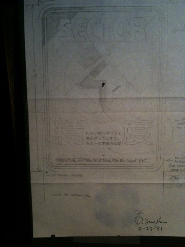
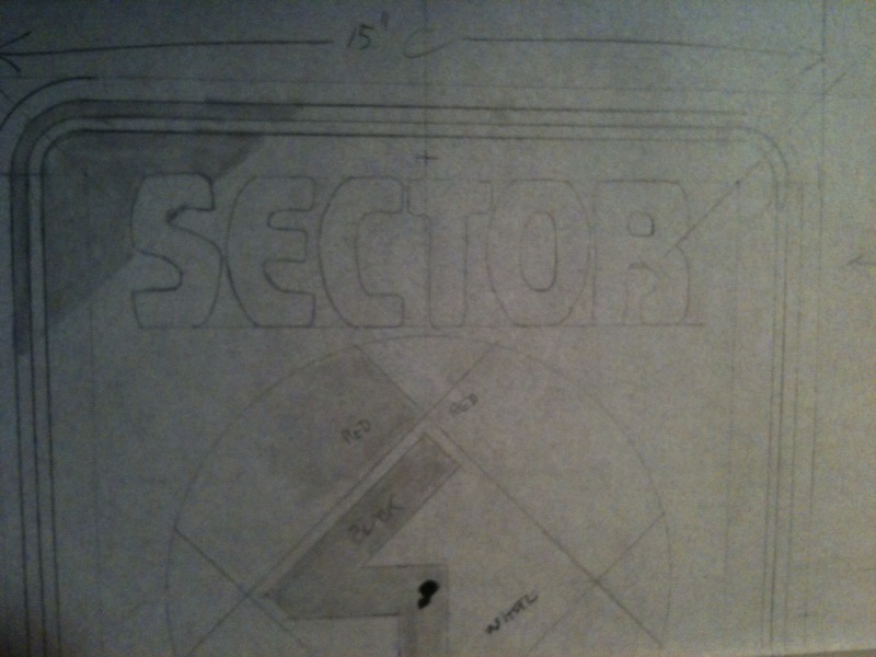
This is (what I think is) a complete list of the neon or electric signs
used in B.R.
(if anyone knows of something I've omitted please chime in, OK?
Neon and Electric Signs:
1. The Snake Pit (originally: The Opera House)
2. White Dragon (3D sculpture atop noodle bar)
3. Dragon #2 (profile in green with a number 1 seen when Zhora dies)
Signs in Japanese:
4. Origin #1 (Asian letter form / mounted high) different from #2
5. Origin #2 (Asian letter form / behind Deckard by White Dragon)
6. Cocktails (with Martini glass above)
7. Huge sign of Japanese - (possibly art supplies - beside Cuisinart sign)
(this one was dropped by crane and had to be replaced)
8. Asian Logo (beside Cuisinneart sign) (a channel letter sign says:? lost art)
9. Four bare tube signs (made for vender karts but placed on glass behind Deckard waiting at White Dragon)
10. Japanese sign (with circle partly indicated above and below)
11. Restaurant (Japanese letters in discs hung vertically)
12. vertical Japanese sign beside cocktails
13. vertical Japanese sign beside previous sign (with moving arrows attached)
14. vertical Japanese sign beside previous (with drum shape at bottom)
15. vertical Japanese sign beside previous ( with point at bottom)
Product Placement Signs I drew:
16. Atari (box electric sign)
17. Bulova
18. Nescafe
19. RCA no dog (seen out Deckards kitchen window) (Ridley probably graduated from the RCA)
20. RCA with dog (on street)
21. Cuisinart animated sign (seen when Spinner rises from street)
22. Dentyne (seen when Batty gets off Vid Phone)
23. Harley Davidson (eagle with logo - on rear of Megatrans Bus - never seen in film)
24. Beer Bottle Neon- (San Miguel)
25. Remy Logo- (script style logo )
26. Jovan
27. Jim Beam
28. Toshiba (vertical with script logo at bottom)
29. Koss Stereophones
30. Excedrin (picture of bottle)
31. Bollinger Champagne
32.Dannon Yogurt neon
33. T.D.K. (seen when Battie dies)
Signs applied to storefronts:
33. L.A. Eyeworks
34. Atriton (back lit sign)
35. The BRADBURY
Signs from "ONE FROM THE HEART":
1. Cowgirl (moves leg)
2. Lady Luck (in an arch)
3. Volute (placed above News Stand)
4. Tall Showgirl (outlined in green)
5. SHOE (vertical - fragment of Golden Horseshoe)
6. Casino
7. TEL (vertical fragment of "hotel") (possibly reused with Japanese letters)
8. SINCO
9. ALGIERS
10. ANACO MART (rearranged large channel letters)
_________________
I've seen things you people wouldn't believe... |
|
| Back to top |
|
|
|
|
|
|
|
|
|
|
|
| Author |
Message |
Tom Southwell
Community Member
Joined: 01 Mar 2013
Posts: 241
Location: Southern California
|
| Posted: Fri Apr 05, 2013 12:22 pm Post subject: Basket refrence. |
|
|
SkinJob, (Fred)
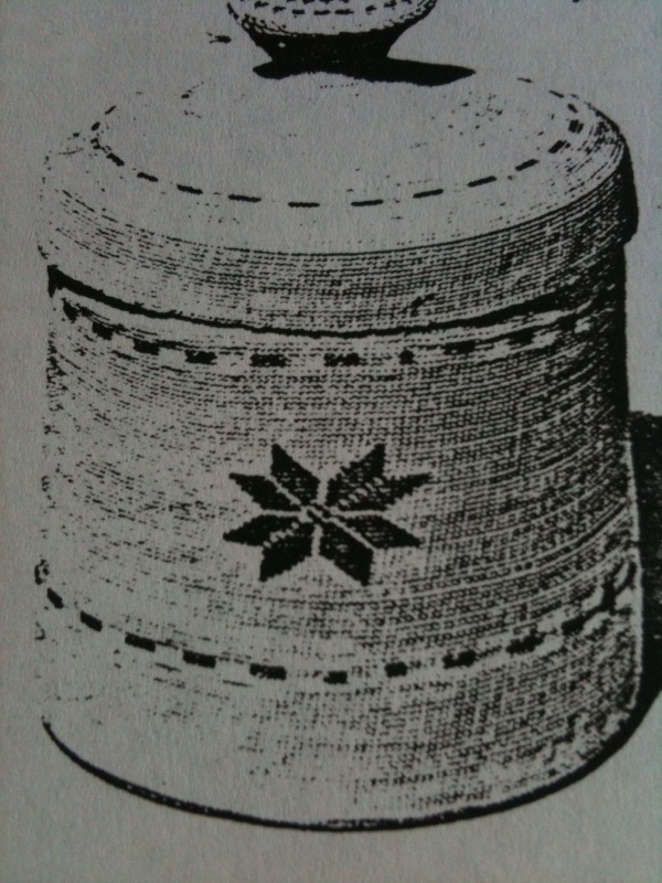
I found these examples of Native American baskets that Ridley had
loaned me. Some were miniatures made by the Pima Tribe after 1900
near the Gila River, Arizona, USA.
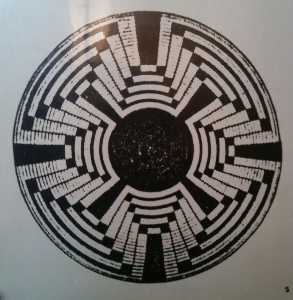
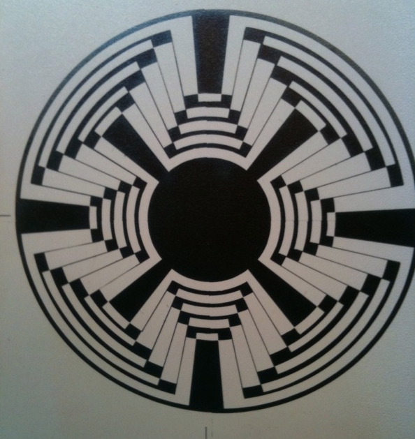
When I presented the art piece to Ridley I suggested this be an animated "light-up" graphic on top of the police station where the outer parts of it light up first and in sequence it steps closer to the middle ( to indicate to the pilot where to land ). Ridley loved the idea. ( There was, at one time, a shot over the pilot , inside the Spinner looking down through the windows in the floor to the top of the building.) Ridley asked ME to bring this idea to VFX and explain it the same way, which I did. However they were squeezed financially so I guess that's why it didn't happen.
TS
_________________
I've seen things you people wouldn't believe... |
|
| Back to top |
|
|
|
|
|
|
|
|
|
|
|
| Author |
Message |
Bassnoir
Community Member

Joined: 28 Dec 2008
Posts: 345
Location: Olympia, WA
|
| Posted: Fri Apr 05, 2013 12:48 pm Post subject: |
|
|
.."One From The Heart"...musical masterpiece that gets very little love...Coppola's recreation of the Vegas Strip on a soundstage was insane as was the incredible Vegas Junk Yard...soundtrack by Tom Waits and Crystal Gayle...an amazing film with amazing design elements...a very hard movie to define...musical...drama...comedy...theatrical...fantasy...mind boggling...all that and Nastassja Kinski...damn damn damn...I love that movie...
_________________
...the future is not all it's cracked up to be... |
|
| Back to top |
|
|
|
|
|
|
|
|
|
|
|
| Author |
Message |
Tom Southwell
Community Member
Joined: 01 Mar 2013
Posts: 241
Location: Southern California
|
| Posted: Fri Apr 05, 2013 12:54 pm Post subject: More triangles and some SS ref. |
|
|
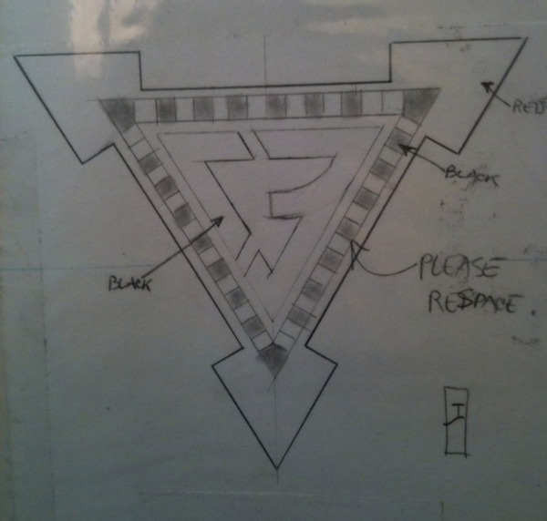
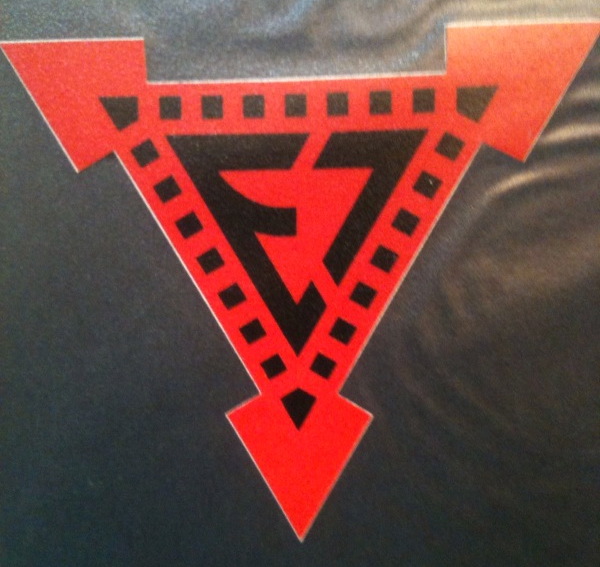
This is a similar graphic to one you see on military aircraft (probably related to explosive bolts and ejection canopy/seats) this was meant for the Spinner.

This fits in the thread where I talk about the "knife on the finger".
Yes that does say "995" at the bottom.
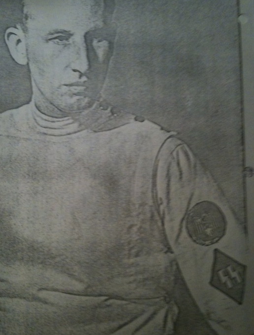
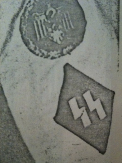
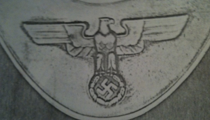
These relate to the part where I talk about the influence of WW2 German army uniforms and how we see them in BR. (This was discussed in Signs Of The Times).
When I visited the Pantheon in Rome Italy, I found one wall that was decorated in the style of Albert Speers (the Nazi Architect). This same style can be seen in the rooms of Tyrell. It is a harsh art deco take on classic forms with silver metal and black marble with sharp edges.
TS
_________________
I've seen things you people wouldn't believe... |
|
| Back to top |
|
|
|
|
|
|
|
|
|
|
|
|
You cannot post new topics in this forum
You cannot reply to topics in this forum
You cannot edit your posts in this forum
You cannot delete your posts in this forum
You cannot vote in polls in this forum
|
|
|
|
|
|
|
|