eethan
Community Member
Joined: 17 Oct 2017
Posts: 153
Location: France
|
 Posted: Wed Jun 27, 2018 1:10 pm Post subject: hong kong microma watch? Posted: Wed Jun 27, 2018 1:10 pm Post subject: hong kong microma watch? |
 |
|
Hello there,
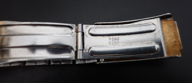
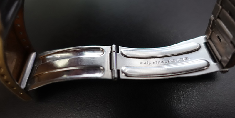
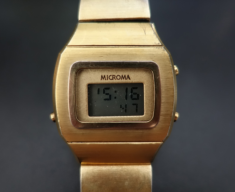
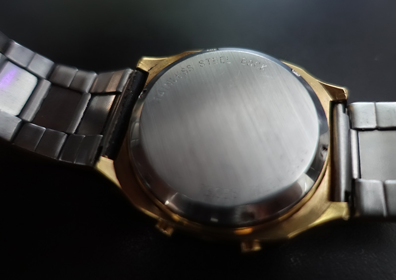
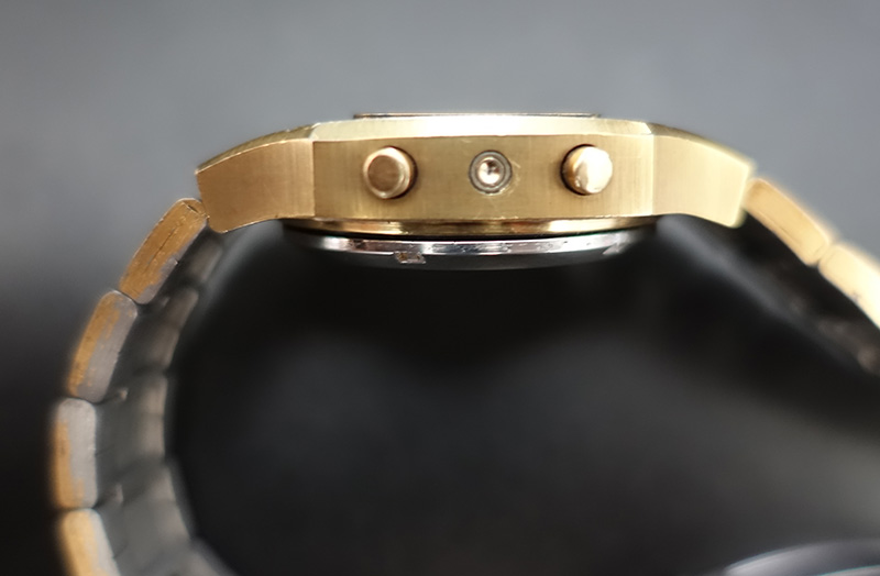
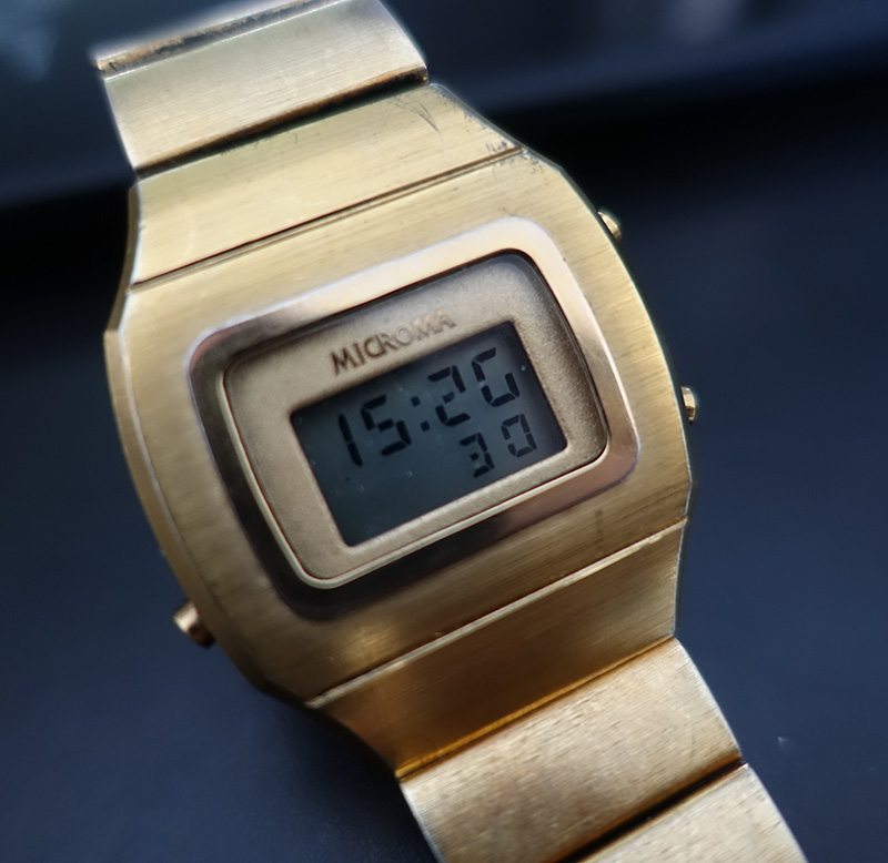
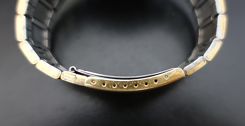
I just got that nice gold Microma and was a little surprised to see an engraving on the clasp saying "hong kong".
I'm a bit scared to ask but does anyone know of something similar? I've seen messages mentioning a uk patent number on the clasp, I've seen photos with nothing there.
other peculiarities are 8 holes on the clasp instead of 9 that I've seen on another one. and the squarish shape of the openable end of the clasp instead of rounder on another one that I've seen.
thanks for your help 
 |
|