|
 |
|
 |
|
| Author |
Message |
phase pistol
Community Member
Joined: 04 Nov 2006
Posts: 1147
|
 Posted: Wed Jan 23, 2008 10:48 pm Post subject: Posted: Wed Jan 23, 2008 10:48 pm Post subject: |
 |
|
?
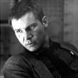
I'm not following you. The shirtsleeve cop (let's call him "Jacobson" for convenience) is wearing a clipon ID card that looks exactly the same as any other, with the diamond-8 in yellow and the red "X" and the "POLICE 995" on top and everything.
That's how it looks to me anyway.
- k |
|
| Back to top |
|
|
|
|
 |
|
 |
|
|
|
|
| Author |
Message |
Once-bitten
Banned!
Joined: 18 Apr 2007
Posts: 1317
|
| Posted: Wed Jan 23, 2008 11:12 pm Post subject: |
|
|
UM...correct me if I'm wrong here guy's but...isn't it 99 S (as in Sam)?
I could have sworn that Southwell said in the "Graphics" section of my DVD set that it's 99S...which kinda cought me by surprise as I always thought it was a five as well... |
|
| Back to top |
|
|
|
|
|
|
|
|
|
|
|
| Author |
Message |
phase pistol
Community Member
Joined: 04 Nov 2006
Posts: 1147
|
| Posted: Wed Jan 23, 2008 11:36 pm Post subject: |
|
|
Yeah well... 
It sure looks like a numeral "5" to me. 
- k |
|
| Back to top |
|
|
|
|
|
|
|
|
|
|
|
| Author |
Message |
spinner44.com
Community Member

Joined: 18 Apr 2006
Posts: 593
Location: Phoenix, AZ
|
| Posted: Wed Jan 23, 2008 11:51 pm Post subject: |
|
|
A little snippet from my interviewing Tom Southwell. This is from September 2006:
(Spinner44.com) I have to ask more about the whole 99S vs. 995 as we have understood it to be. Where does 99S come from? What were your interpretations?
(Tom Southwell) LIKE I SAID, IT WAS MY TAKE ON A FUTURE 911 (POLICE EMERGENCY NUMBER).
I NEVER WAS SURE IF IT SAID 99S OR 995 AND IF YOU WERE PUZZELED THAT'S OK. RIDLEY LIKED IT WHEN THE AUDIENCE HAD TO MAKE SOME GUESSES ON THEIR OWN. I BELIEVE HE KEPT IT A SECRET ABOUT DECKARD BEING A REPLICANT (OR NOT) BECAUSE THEY WERE ALL ENTITLED TO THEIR INTERPRETATION (EITHER WAY). BUT LET'S FACE IT THERE WERE A DOZEN OR MORE CLUES.
THIS IS ONE OF THE THINGS I LIKE BEST ABOUT BR. YOUR INTERPRITATION IS VALID. 99S , 995 I DREW THE FONT BY HAND AND HAD TO MAKE UP LETTERS THAT WERE NOT ON THE GROUCHO ALBUM SO IT COULD BE EITHER. HAVE YOU EVER DRAWN A FONT WITHOUT A COMPUTER?
-------------------------------
BTW, the album he refers to is a Groucho Marx album seen below. It was his typeface inspiration for the Police 995/S graphics. Hope this was helpful.
 |
|
| Back to top |
|
|
|
|
|
|
|
|
|
|
|
| Author |
Message |
Once-bitten
Banned!
Joined: 18 Apr 2007
Posts: 1317
|
| Posted: Thu Jan 24, 2008 11:19 pm Post subject: |
|
|

I gotta admit, the differences are subtle.
First one (S) from the front of a screen used ID, second (5) from the back. |
|
| Back to top |
|
|
|
|
|
|
|
|
|
|
|
| Author |
Message |
Nexus6
Community Member

Joined: 15 May 2006
Posts: 473
Location: Off-World Colonies
|
| Posted: Fri Jan 25, 2008 12:21 am Post subject: |
|
|
| Once-bitten wrote: |
I gotta admit, the differences are subtle.
First one (S) from the front of a screen used ID, second (5) from the back. |
Well, just like many other things in BR, Southwell stated that the character was left ambiguous, i.e., it could be a "5" -OR- an "S".
PERSONALLY, I see a "5". If it weren't, in my mind, the shape of the character would have been different:

*shrugs* |
|
| Back to top |
|
|
|
|
|
|
|
|
|
|
|
| Author |
Message |
phase pistol
Community Member
Joined: 04 Nov 2006
Posts: 1147
|
| Posted: Fri Jan 25, 2008 1:47 am Post subject: |
|
|
Nexus6: that's it, you nailed it. If he were drawing an "S", he would have made it vertically symmetrical. What Southwell drew, can only be a "5".
I can say this because I am a graphic designer myself. In school I drew letterforms by hand on illustration board, with liquid Plaka paint, just as Southwell would have done to make his designs.
- K |
|
| Back to top |
|
|
|
|
|
|
|
|
|
|
|
| Author |
Message |
nickytea
Community Member
Joined: 21 Oct 2007
Posts: 12
|
| Posted: Fri Jan 25, 2008 5:09 am Post subject: |
|
|
| How can an S be symmetrical???? |
|
| Back to top |
|
|
|
|
|
|
|
|
|
|
|
| Author |
Message |
phase pistol
Community Member
Joined: 04 Nov 2006
Posts: 1147
|
| Posted: Fri Jan 25, 2008 12:13 pm Post subject: |
|
|
 |
|
| Back to top |
|
|
|
|
|
|
|
|
|
|
|
| Author |
Message |
phase pistol
Community Member
Joined: 04 Nov 2006
Posts: 1147
|
| Posted: Fri Jan 25, 2008 12:17 pm Post subject: |
|
|
| Once-bitten wrote: |
I gotta admit, the differences are subtle.
First one (S) from the front of a screen used ID, second (5) from the back. |
Yes, but your "5" on the back, is from a different font. The "5" is from "Data-70", which is used for the serial number on the ID.
- k |
|
| Back to top |
|
|
|
|
|
|
|
|
|
|
|
| Author |
Message |
andy
Community Guide

Joined: 01 Nov 2006
Posts: 6237
Location: Rochester, NY
|
| Posted: Fri Jan 25, 2008 8:04 pm Post subject: |
|
|
Sounds like Southwell meant it to be somewhat ambiguous, so he may have wanted it to be both a '5' and an 'S', depending. Or he meant it one way, and everybody(or just Ridley) started calling it something else, so he just went with it.
As far as the Jacobson ID. Download Karl's Photos from worldcon and look at the close ups. It does look like the Red 'X' was a seperate element from the card but was behind the lamination.
As far as Jocobsons hair, my experiments with heat laminated pouches also had a similar effect with the black areas as his hair did. Maybe because those areas just absorbed the heat more. They seemed to have more bubbles in them. Perhaps making the plastic melt more and begin to bubble in those areas. Or the opposite where the paper absorbed the heat keeping the temp too low for it to adhere. It is more pronounced in areas of high contrast too. |
|
| Back to top |
|
|
|
|
|
|
|
|
|
|
|
| Author |
Message |
phase pistol
Community Member
Joined: 04 Nov 2006
Posts: 1147
|
| Posted: Fri Jan 25, 2008 9:45 pm Post subject: |
|
|
Interesting theory on the heat absorption of black areas. I'd like to see some examples of that.
This is my theory of the layers that the ID card is made from... I now believe the yellow diamond-8 is just printed on there, because on the "V" card prop, the 8 logo is yellow there as well.

- k |
|
| Back to top |
|
|
|
|
|
|
|
|
|
|
|
| Author |
Message |
andy
Community Guide
Joined: 01 Nov 2006
Posts: 6237
Location: Rochester, NY
|
| Posted: Fri Jan 25, 2008 10:01 pm Post subject: |
|
|
| From what I have seen and heard from Southwell on the DVD's is that the black graphics were Photostat negatives that they took of the flat B&W artwork paste ups. The 'Name' and the color of the 'Eight' could be just behind the Photostat. Thus allowing them to make several variations of the ID for different actors with the same Photostats. It would explain why the ID # is the same on both Deckard's preliminary artwork and the final of the Jacobson ID. The red or 'orange' X is most likely amberlith(or maybe rubylith), also a graphic designers tool in making the Photostats. The ID portraits were likely cut from a poloroid shot, maybe even a passport or ID camera, that would make a set of four photos all about that size. |
|
| Back to top |
|
|
|
|
|
|
|
|
|
|
|
| Author |
Message |
Masao
Community Member

Joined: 18 Jun 2007
Posts: 143
Location: USA
|
| Posted: Sun Jan 27, 2008 12:14 am Post subject: |
|
|
Well, Phil made a badge! So if he made a badge, then there must be a badge! Phil is never wrong about these things!!!
To be fair though; if you have ever seen Striebeck''s badge wallet from "Dragnet", you can seen a 1980's example of a wallet which has a an extra flap for covering the badge.
BTW, I am guessing the hovercycles made for BTTF II were recycled from BR. |
|
| Back to top |
|
|
|
|
|
|
|
|
|
|
|
|
You cannot post new topics in this forum
You cannot reply to topics in this forum
You cannot edit your posts in this forum
You cannot delete your posts in this forum
You cannot vote in polls in this forum
|
|
|
|
|
|
|
|